Review: Just My Type, by Simon Garfield
 |
| Just My Type a book about fonts by Simon Garfield Gotham Books September 1, 2011 $27.50 / 356 pgs |
That should be the warning on Simon Garfield's clever, intelligent and, almost more importantly, very entertaining book, Just My Type - A book about fonts, new today from Gotham Books. It's one thing to dabble in fonts. I think everyone dabbles a little, from choosing the right font to word your essay in (i.e. maybe something a little wider, something that will inevitably make it look like more when you've written less?) to choosing the right fonts for your blog or for a homemade card, or for a business card, or maybe to advertise a lost dog.WARNING: Take a good look around you - at signs, advertisements, books, bills and instruction manuals - take a good look. You'll never look at these things the same way again.
 |
| Doesn't Talky Tina seem a little friendlier on the left? |
Fonts are extensions of one's personality. We use them to emphasize, to cheer up, to show sincerity, and to establish power. What Garfield does is explain where these things called fonts came from, and why we have certain responses to certain letter forms. There are only 26 letters and over 100,000 different typefaces... there's only so much time in the world, so don't expect an explanation of every font ever, but Garfield does an excellent job of covering the basics, from the earliest printers to the newest faces in typefaces (for example Calibri, one of Microsoft's oft-used fonts of late was only created a few years ago - why didn't they stick with the ever familiar and comfy Helvetica (which you New Yorkers may recognize from your local subway signs which use Helvetica Neue, an updated Helvetica) or the user- and web-friendly Georgia? That's what this book is about - the whos, whys, wheres, whens and hows of fonts.
And I promise, once you start, you're going to start analyzing all of the branding and packaging around you. For instance, I can tell you that the font on my window fan's box is Trebuchet because I'm familiar with Trebuchet's individual body parts - its ascenders and descenders, its counters and tails - geographical features that form the map of the font. And trust me, once you know what to look for, you might not stop.
 |
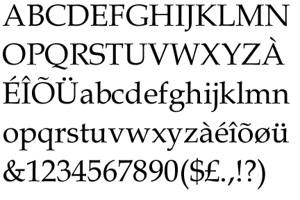
| Book Antiqua (a slab serif, Copse was, I think, the closest thing I could find to it, hence Copse on the blog.) |
as a lover of typography and graphic design in general, I think I'd totally love this book
ReplyDelete